It’s not a secret that the most important page of any website is a landing page. How to create a good landing page for your portal - this is the topic of this blog.
Landing page is a key to your portal business-scheme success. As website owner, you’ll receive the desired reaction from users if this page manages to finally persuade (and not to scare away) the audience to make one last click.
The goal of this post is to:
- Define clearly what the landing page is.
- Provide examples and some advice on how to create an effective landing page.
Let's first take a look at the situations where landing page fits the best. It is used to:
- Encourage user to register on the site, or to subscribe to the newsletter.
- Sell a product in a certain situation (sale, promotional campaign).
- Encourage user to download or install the software.
Having analyzed these points, we can conclude that the main purpose of the landing page is to encourage the user to perform the target action of the website.
Now let’s enumerate the main elements of a good landing page:
- Call to action.
- Arguments in favor of this action.
- Gaining users’ trust.
Call to action
This element should encourage the user to perform a certain action on the site.
Calls to action are implemented in the following forms:
They may be present in selling texts;
- Buttons "Order", "Subscribe", “Buy” etc.;
- Images;
- Videos.
Arguments
This element has to show why the customer should buy a certain product, sign up or download the software on your website. Arguments should focus on:
- Profit;
- Advantages over competitors;
- Time constraints (sales).
Trust
A very important element for landing page’s success. As a vast amount of users (especially in the CIS countries) check information about the company before buying its product. Factors which determine credibility of the landing page:
- Official address of the company;
- Warranties;
- Reviews;
- Certificates.
A good structure of a landing page
Taking into consideration information mentioned above, let’s try to create a schematic model of a good landing page:
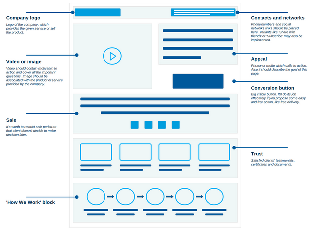
Of course elements may vary depending on the purpose of your landing page, but there are also obligatory ones which include call to action, conversion button and trust gain.
Great Examples of Landing Page Design
Now let’s look at the real-life examples of successful landing pages:
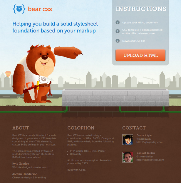
Clear and simple!
This page does not sell anything and does not ask to download anything, but helps users to create CSS-template based on the HTML-document. A non-standard service is being proposed to users, but simple design and clear instructions cope with this task.
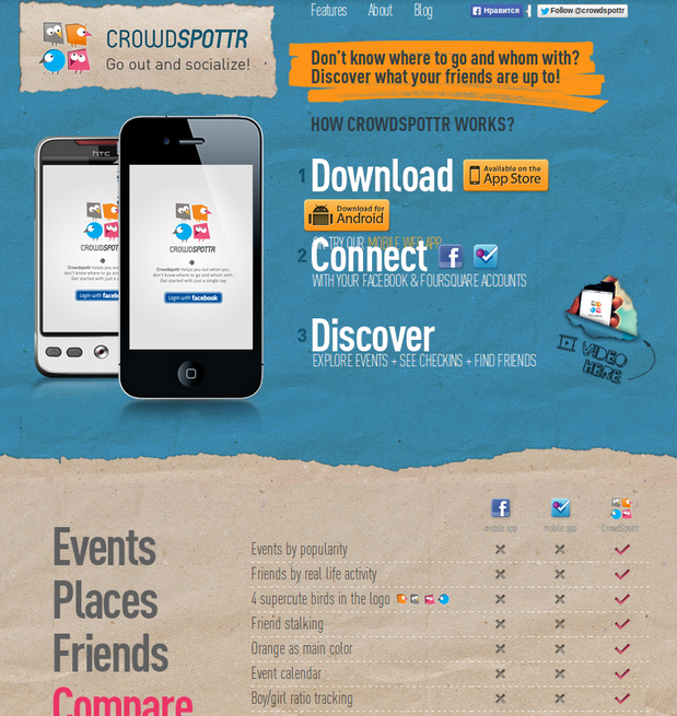
Non-typical approach!
Why was the following landing page chosen as an example? Indeed many web developers use landing pages to promote their applications. The creators of Crowdspottr do this in a special way - they ask questions and give the answer immediately. How to use crowdspottr? Download the app, log in and enjoy. Everything is simple and clear.
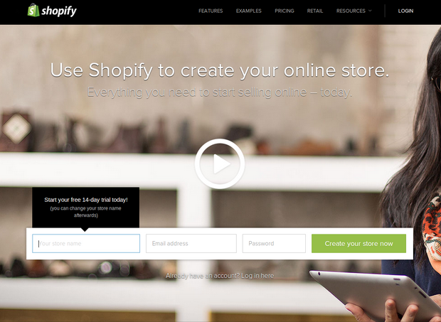
Nothing excessive!
This service allows the users to create their own online store. Clear title and a simple registration form on the website.
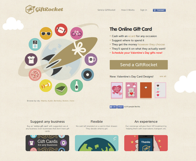
Attractive!
Giftrocket explains the process of buying e-gift card using clear call to action. Everything is simple, accessible and attractive.
We hope that by following simple tips and examples mentioned above, you’ll be able to create an effective landing page for your project!
If you need help, our web designers can create an amazing landing page that will attract more customers.
