


More and more people, including your potential and existing customers, are entering the Internet via mobile devices, which are growing in variety. That’s why it’s important to know how responsive web design works and use its benefits. You can implement one of the free responsive Drupal themes that matches your business sphere, for example, one of the responsive Drupal themes for construction websites.
If you want to see your web resource through the eyes of your users and see how convenient it is, use the appropriate tools. We have created a collection of free online services for site responsiveness testing. All you need is to just enter the URL of any web page of your website and see how its layout displays on different devices.
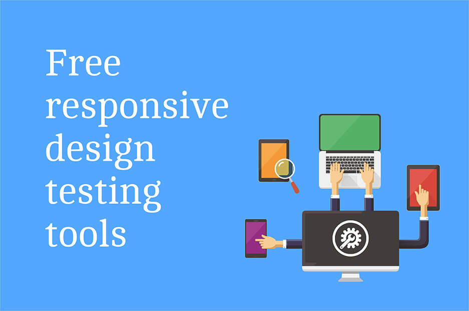
Free responsive design testing tools
Responsive Web Design Checker
This service allows you to check how responsive your website is by choosing from big lists of devices within three categories: desktop, tablet and mobile phones. Unlike many other tools, this one has settings for the Apple iPhone 7 and iPhone 7 Plus. Responsive design checker monitors the latest models and updates its assortment accordingly.
Screenfly
Screenfly’s drop menus offer you a variety of screen previews to choose from, including even televisions along with desktops, tablets and smartphones. If that’s not enough, and you want to find out how your website will be displayed on some device which is not listed, then there is an option allowing you to set a custom screen size by entering width and length values.
Responsive Web Design Test Tool by Designmodo
This free service offers a wide range of viewpoints including smartphones, tablets, laptops and desktops of various brands and various models, which you can find in dropped menus, as shown below.
Responsinator
This online service shows ten mockups and is focused completely on mobile devices. This web resource also takes into account that fact that when gadgets are positioned vertically, they display web pages differently than when they are positioned horizontally.
That’s why Responsinator shows both portrait and landscape viewpoints for each of five devices: iPhone 5, iPhone 6, iPhone 6 Plump, Android (Nexus 4) and iPad. All dimensions are loaded at once, so that you don’t have to click to select, just scroll.
Responsive Web Design Testing Tool by CSSChopper
This free responsiveness testing tool shows both portraits and landscapes for Android, iPhone, iPad and even Kindle e-readers.
Am I Responsive?
This is a simple online service that shows how your website will look like to those users who have Apple products. It shows four viewpoints: desktop (1600x992px), laptop (1280x802px), tablet (768x1024px) and mobile (320x480px).
Responsive Web Design Testing Tool by pixelturner.de
This free responsive design testing tool allows you to observe how your web resource will be displayed from four views. Enter your URL and see the output.
These cross-device testing tools mentioned above will help you develop a vision of your website's responsiveness. If you discover that your site needs improvements, let us offer our responsive web design services to satisfy the needs of your site users.


