


If you already know the name of Ethan Marcotte and the term “responsive design”, you have chosen the right direction. If not — this direction is a fortiori necessary for you. Let’s take a look at the brief history of the responsive web design.
The origins of responsive web design
Once upon a time, their coded a guy named Ethan Marcotte. He already knew what fixed-width design and mobile revolution were, but he was not completely satisfied with these terms, and as many other mobile users he hated the problems with website performance on different screens.
‘This cannot last forever’ — decided Ethan one morning and started to write an article.
The article was titled “A list apart” and saw the light of day in May 2010. It contained a previously unknown term, “responsive web design” that gave Ethan an opportunity to become a godfather of a new wave in web development. The main idea was to adopt websites to different screens.
However, persistent guy Ethan Marcotte did not stop on that and even wrote a book published one year after — in 2011. The work “Responsive Web Design (Brief Books for People Who Make Websites)” became a guideline to the developers who followed Ethan’s principles.
What was the book "Responsive Web Design" by Ethan Marcotte about?
The core of the responsive design is that you have one website with one URL and content that is resized and reorganized according to different screens.
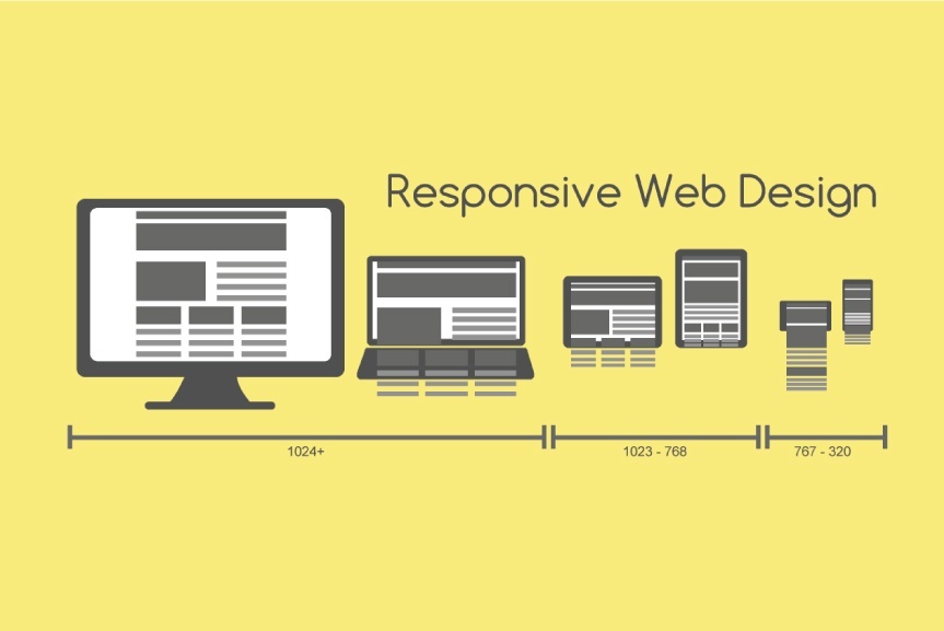
This works due to three main components: flexible layouts, media queries and flexible media.
Flexible layouts are mainly grids — websites designed as different cards, so they can be simply modified by size and sequence according to different devices.
Media Queries is a way to adopt items by height and width, resolution and so on. In particular, there are typical screen resolutions: 1920 PX, 768 and 460, so the website page operates in fours or three variants and performs differently according to a type of device.
Flexible media is an option of modifying a size not within a template but automatically expand or constrict an image or video — just check moving a website window with your mouse.
Responsive design is about layout that may be the first stage of developing a website, but usually follows the design. Developers create responsive pages and code them. Therefore, Ethan’s novelty was approved by developers all over the world, and while his name is not a legend, responsive design is a dogma nowadays.
Why does your website need a responsive design?
- 51% of Americans access internet via mobile devices, comparing to 42% who use a desktop computer.
- 25% use only mobile devices for internet.
- 69% of tablet owners shop via tablets every month.
So let’s give Ethan an opportunity to continue mastering design and public speaking (as far as he is also an experienced trainer) and try to become more skilled in responsive design. Immediately now, thousands of web developers worldwide code responsive websites, and you might be among them either.


