


Some people initiate their business mistakenly thinking that they will just launch a powerful website and start making big money. However, you need to deal with a great number of everyday tasks to succeed in online business and be popular among users. On top of this, you should always remember this one simple but helpful idea — put yourself in the customer’s position. One way to do this is answer the question, “How much time am I spending using mobile devices to browse the web?” You may be surprised by your own response. Today, we are going to explain what this all has to do with responsive web design, and why your site should be responsive.
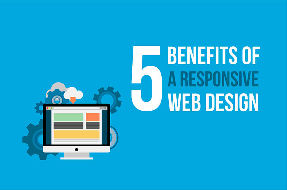
Essential benefits of responsive web design
-
Responsive web design brings more mobile traffic
Now, people have consistent access to the Internet, whether they are at the queue of the supermarket or on the way home. They use every opportunity to surf on their smartphone. This trend is strong with a whole wide range of mobile devices. Basically, the main function of responsive web design is to adapt your website to multiple formats (desktops, tablets, smartphones, etc.). This means that that your content is flexible enough to move freely across all devices and users can view your website without going crazy.
-
Responsive web design provides excellent user experience
First impressions are everything. Someone who is visiting a web page for the first time from any device wants to easily browse a responsive site. Thus, responsive design is about providing a consistent user experience. Your visitors will be satisfied with the usability of your website and come back for more. If this is not done, your bounce rates will increase, and you may lose many of your potential clients.
-
Responsive web design improves your SEO
Responsive web design is becoming more and more important for SEO. Google likes responsive websites for a number of reasons. Firstly, responsive design websites have one URL (and the same HTML) irrespective of a device, which makes it more efficient for Google to index your website. Secondly, it is much easier for users to share content which is located on one URL. Lastly, if you have a single responsive website instead of separate desktop and mobile versions, you can avoid the issue of duplicate content and, as a result, the negative impact on your search rankings.
-
Responsive web design costs less
Being one of the hottest trends, responsive web design is more than meets the eye. Compared to having two separate websites, it can save on cost and time. You should not waste precious time and resources creating a mobile version of the website along with the existing desktop website. With a responsive design, you can build a single web resource which is optimized for all the devices and achieve significant savings.
-
Responsive design websites are easy to maintain
Running two separate desktop and mobile versions of your website means that you need to have two separate SEO strategies. But with responsive web design, you have only one website that needs to be updated. It’s very simple. Obviously, managing one resource will take less time and cost less. Besides, you can easily and quickly make any changes to the website through multiple devices.
The list of benefits of responsive web design could continue. No wonder this is a hot topic these days. Building a website that is 100% responsive isn’t a big challenge. If you already have a website, then you should consider testing its responsiveness. There are great free responsive design testing tools. Or ask for professional assistance from our highly experienced website maintenance company, no matter what website issue you face!


