


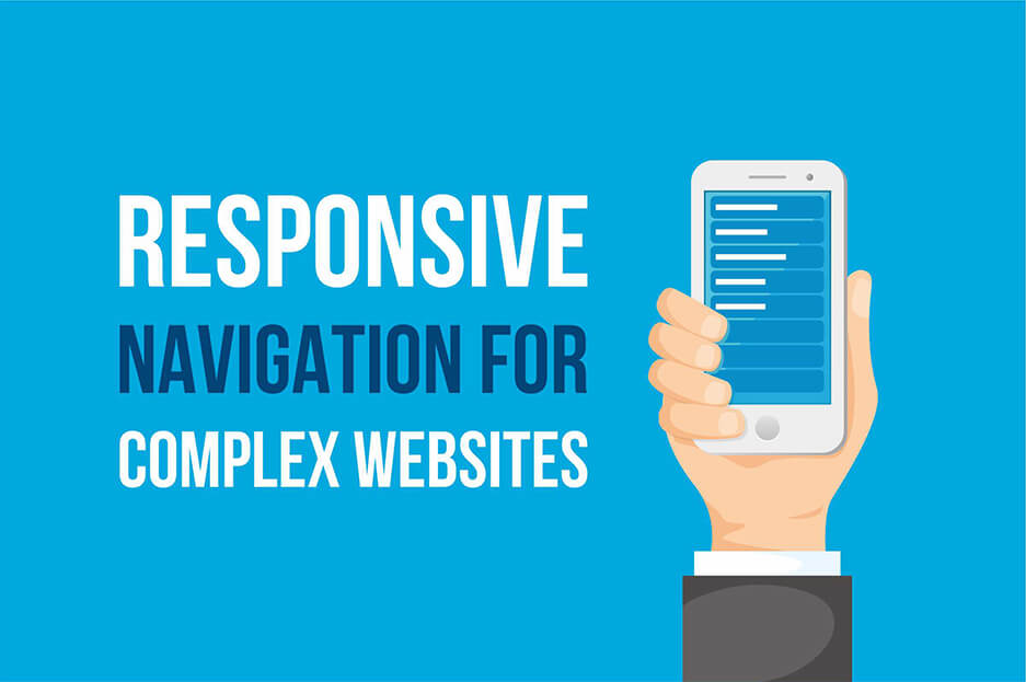
“Keep it simple” is probably one of the most popular tips for website design. It is especially often used when it comes to improving website navigation. However, when you have multiple products, services, departments, and so on, you will most probably need complex menus. The super task here is to make them easy to use, as well as keep them in line with responsive web design principles, so the mobile audience enjoys them as well. Sounds complex? Let’s make complex things easy! Today, we will review a few ideas on responsive navigation for complex websites.
Opportunities for responsive navigation on complex websites
Accordion menus
A complex responsive website can look great with an accordion menu. A user will see a primary menu, most frequently a vertical one. The desired submenus can then be opened by tapping. To let a user know about this opportunity, the menu has special icons (plus signs, arrows, carets, the digit for available items, and so on). This technique allows for multiple levels. Previously opened submenus collapse upon a click or, automatically, when a user moves to the next ones. For multi-level menus of this kind, the term “multi-toggle” is also used.
Multi-level push menus
Like in accordion menus, the submenus in multi-level push menus are opened upon tapping. However, their special feature is that submenus open to the right and overlap with the previously displayed set of categories, or cover them totally. These menus are also equipped with a back button for handy navigation. A great advantage of these menus is that the number of nested categories can be unlimited.
Right-to-left flyout menus
In this type of menus, a user can activate the subcategories by tapping on the main menu, and they will slide in from the right. Unlike the multi-level push menus, the subcategories here do not overlap with or cover the previously displayed items. Instead, the whole structure moves to the left. These exciting animated menus are a great fit for responsive navigation on complex websites.
Off-canvas menus
Off-canvas menus are ones that are located outside a user’s viewport and only slide in when a user activates them. This technique is awesome from the point of view of mobile usability. It is combined with other menu techniques and gives you valuable space for complex, responsive navigation.
Separate menus for different audiences
A great practice for complex sites is to cater particular content to different audiences. For example, you could offer users to choose if they want to shop for men’s or women’s clothes, surf your site as real estate agents or buyers, job seeker or employee, and so on. They will then be taken to specially tailored pages of your site and see a menu just for them. This eliminates the need for extra menu levels.
Just primary menus
You could also keep it totally simple. For some websites, it is quite OK to only offer the primary menu. By clicking on a particular section, your users are getting where they wanted. There they can be offered more detailed categorization.
Footer navigation
You can let your users see your website first and then decide where they want to go. A footer with all useful links could be a nice solution for that.
To recap
This is not yet the full menu of all available menus ;) If you have a complex website or plan to get one, entrust everything to our website development company, including the perfect responsive navigation, and we will find the best approaches to it. We could combine different techniques for your particular case.
Let your complex website have the most convenient, responsive navigation!


