


Website owners and online marketers traditionally strive to reach out to their target audience, work at their site usability, go mobile-friendly, and try to please their audience’s eyes with beautiful design in every detail, including even an attractive 404 pages. What’s the fuss? Too many customers — too many troubles! So, discover 10 web design elements that serve as sure ways to annoy and eventually get rid of your users.
Ironic as it all may sound, that seems to be the effect these design features cause on many websites. Check to make sure yours is not among them ;) OK, let’s delve into the world of bad design examples and the art of being truly annoying to your audience.
NB. Using just one of these design elements might not be enough to thoroughly annoy your audience. For an enhanced effect, apply a combination of them!
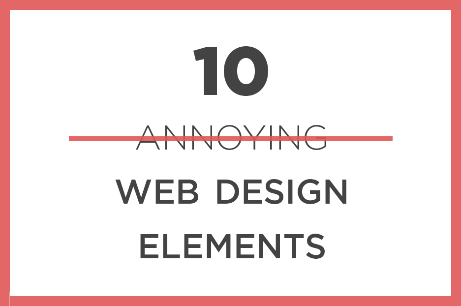
Design elements to get rid of your users
-
Pop-up mania
A sure method to make your audience really hate you are to put pop-ups everywhere — the more, the better — and annoy your website visitors at their every step. Like spice in a dish, pop-ups (aka modal windows) can only do their job well when used sparingly and up to the point. If you promise to have this idea in mind, feel free to check out our in-depth tutorials on creating pop-ups in Drupal 7 and Drupal 8! You could also read our insight into making pop-up squeeze pages less annoying.
-
Flashing ads
In the collection of annoying web design elements, there are those that create an especially disorienting, distracting or annoying effect even on the most patient users. Chief among these are flashing and blinking advertisements, stuffed with excessively bright colors.
-
Footer content running away
Here is a way for your customer to lose patience and for you to lose a customer. It can be done through the non-careful use of infinite scrolling (aka endless scrolling). This is generally a nice design technique that smoothly uploads a new portion of content when a user reaches the end of the previous one. However, if there is much content to scroll, do customers really need to make a long journey to see your footer, especially if they want to get your contact information fast?
-
Poor contrast, unpleasant colors
Too little, just like too much contrast, as well as unpleasant color schemes, are likely to have the same tiring effect on the eyes. No matter how valuable your content is, eyes are more valuable to any user, so it often ends with them leaving the website.
-
Many different fonts
Too many fonts make the text less readable, create confusion and an impression of a cluttered website. “Too many” here means more than two or three.
-
PDFs instead of real pages
What are seemingly innocent PDFs doing on the list of annoying design elements? Nothing, if it does not replace all content. PDFs are good for certificates or other testimonials, as well as some e-books or whitepapers. All other content should be committed to real pages — though it may also have a PDF equivalent to download.
-
Too large blocks of text
Large and uninterrupted chunks of text are hard to read, especially because Internet users are always on the run and not planning to read novels. Paragraphs, subheadings, and images, dividing the information into blocks and other design solutions could change the situation.
-
Generic stock images
People will never believe that a group of beautiful people with Hollywood smiles, hoping with happiness and jigging their suitcases in the air are your real team. They may have seen these images somewhere — about a million times. On the contrary, real photos and unique images create trust and respect.
-
Unclear calls to actions
“OK, your product looks good, but what should I do next? It’s unclear where to click and I have no time to delve into it, so goodbye!”. Unfortunately, users often think this on poorly designed sites.
-
Autoplay videos and background audios
The negative effect of autoplay videos is a point of debate among web design experts nowadays. However, people often browse a web while listening to their own music, or while just enjoying silence, so give them a choice to start a video. An especially annoying effect is created by a high volume level or harsh sounds that users have to hear right into their ears through their headphones.
Audio may include nice music, but the pleasant effects lessens with every time you browse the same website. In addition, autoplay elements can be overloading, especially when it comes to mobile devices.
Here are just some of the design elements that will help you get rid of your users by annoying them all the way through… but maybe it’s better to get rid of these features instead? ;) So if you are ready to have a thorough website clean-up and improvement, get in touch with a team of web design experts!


