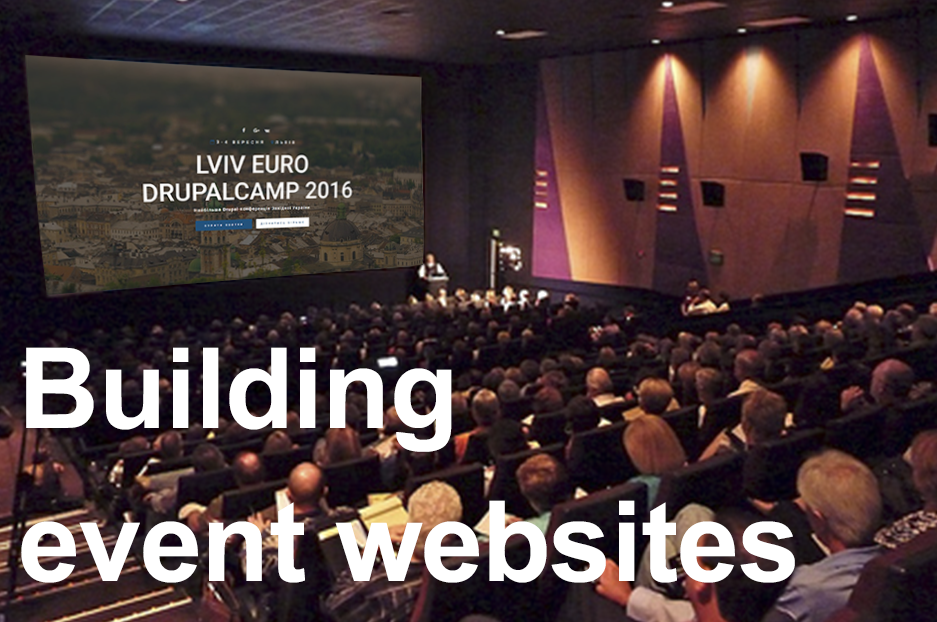
Organizing events is a real art, and an important brush stroke in your masterpiece is a website that will showcase it to the world. Visitors will come and decide whether they want to become your attendees. Sponsors will make up their minds whether your event is worth funding. So what should you consider when building an event website that looks convincing, inviting, and irresistible? Let’s find out!
Build in advance: give Google the time to find you
Last-minute decisions sometimes happen in event organizing, but this shouldn’t be the case when creating a website. Your site must be easily found by search engines long before the conference, as it may take Google several weeks, or sometimes longer, to index your pages. A good SEO expert can significantly speed up indexing, though.
Entertain, fascinate, capture people’s attention
Let your visitors be immersed in the atmosphere of your conference as soon as they land on the site. Eye-catching large images or image sliders on the main page (with happy attendees, city scenes, and the like) do this perfectly. Videos could enhance the impression, too. Elements like a countdown of the time left before the conference help stir up interest, and encourage sign-ups.
Make the must-have event website’s elements easy to find and use:
- The clear “what, where, when” of your conference: Be sure to make the event’s date, time, venue, and main subject clearly visible on the main page. To help people visualize the venue, be sure to embed a map. Links to the pages with additional information about the city, its attractions, and places to stay could also encourage a user’s positive decision.
- Clear and easy sign-up / payment: It’s not only that the sign-up / payment buttons should be prominently placed, but the process itself should be quick and easy, with minimal required fields. The payment functionality can be custom-built, or you can use one of the well-known ticket-selling services available on the Internet.
- The agenda, the schedule and the speakers: Provide the topics of the speeches or workshops with the exact schedule, the names of the speakers, and add their photos, bios and achievements so everyone knows what exactly to expect and why it is worth coming.
- Sponsorship info: Add your sponsors’ logos, describe the benefits of sponsorship, and provide eye-catching apply buttons.
- Social media icons: When it comes to conferences, the bulk promotion takes place in social networks. They offer great functionality for creating your event, posting updates about it, engaging your audience, and getting their likes and shares. Let your social media pages work in a tandem with your website. Consider creating a special SMM #hashtag and featuring it on your website.
- Your contacts: Include all popular ways to contact you, so potential attendees /sponsors can ask about whatever they are interested in.
Be responsive: include mobile users
Having a mobile responsive website, which adapts itself to any mobile screen, is becoming an absolute necessity of the 21st century.
Keep your audience updated
Regularly posting interesting news and blog posts about the event is a way to heat up the interest, remind those who are going about the event, and attract the attention of those who are hesitating. This will also help attract the attention of Google.
Maintain your recognizable style
All colors and fonts on the website should go well with your specially created event logo to create the special look and feel of the event.
Have an unforgettable event! If you wish to entrust building your event’s website to Drupal development experts, we are here for you.

