


Embed code for Infographics (3 parts):
<a href="//internetdevels.com/blog/50-point-checklist-for-website-usability-testing" title="50 point checklist for website usability testing" target="_blank"><img src="https://store.internetdevels.com/i/c358a611b6/900x9272-50-point_checklist_for_website_usability_testing-1.jpg" alt="50-point checklist for website usability testing"/></a>
<a href="//internetdevels.com/blog/50-point-checklist-for-website-usability-testing" title="50 point checklist for website usability testing" target="_blank"><img src="https://store.internetdevels.com/i/c358a611b6/900x6109-50-point_checklist_for_website_usability_testing-2.jpg" alt="50-point checklist for website usability testing"/></a>
<a href="//internetdevels.com/blog/50-point-checklist-for-website-usability-testing" title="50 point checklist for website usability testing" target="_blank"><img src="https://store.internetdevels.com/i/c358a611b6/900x3661-50-point_checklist_for_website_usability_testing-3.jpg" alt="50-point checklist for website usability testing"/></a>
This is the day to acknowledge and celebrate website usability achievements globally! Today is World Usability Day! This blog is dedicated to all those user experience enthusiasts and experts out there who recognize the importance of website usability, and make lots of efforts to contribute to user experience worldwide in order to make it as seamless as possible.
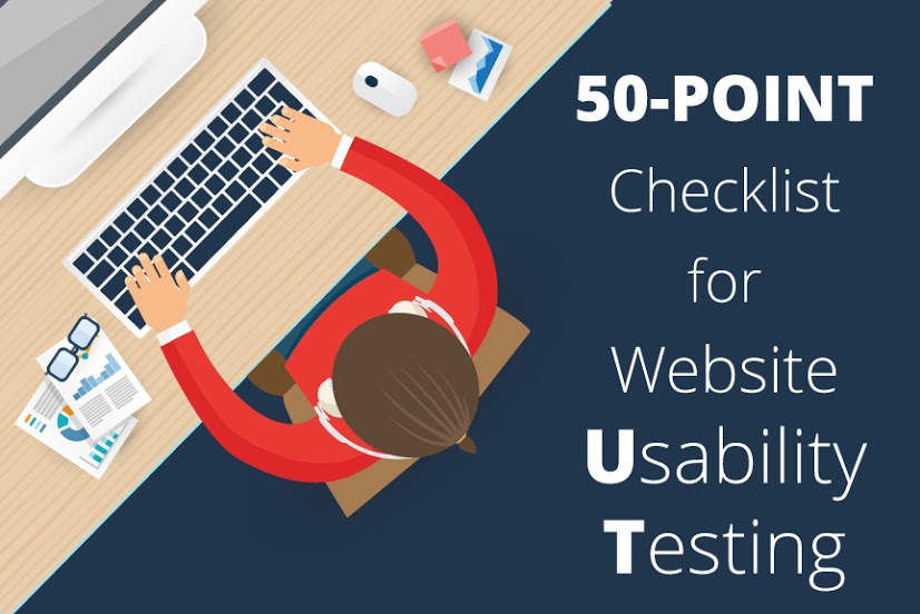
World Usability Day is a special day that brings together web developers, web-designers, QA testers and other communities of professionals with the same values and goals: to make life easier and simpler. This day is about celebration of what we have attained in improving already existing products as well as envisioning the future of UX trends and strategies. We have prepared this 50-point checklist for website usability testing, hoping that you will find it useful and it will help you steer clear of inconveniences of poor design and low website quality. So, have fun reading about usability fundamentals from A to Z!
Knowing Users’ Psychology
Knowing users’ psychology you are one step closer to improving your website usability. Familiarizing yourself with the following hints and then putting them into practice will go a long way:
1) An outstanding UX design will give answers to three questions users have in their mind. They are pretty simple: “What it is about?”, “What is the benefit?” and “What is next?”. So, let them know what your page is about by indicating it in the headline or image. Next, show users’ the benefits, but don’t mention the reasons why you want them to buy something, log in or just make a click. Present what they will get, using your offers. When the user knows what it is about and its benefits, he or she should see the next step. It might be “log in”, or “how to begin” buttons.
2) It goes without saying that design should inspire confidence. People usually trust those companies which seem like real ones, and they can be sure that you are not going to deceive them.
3) Nothing is perfect, so it is OK if you have both positive and negative comments. Actually, products which seem to be splendid are quite often considered to be suspicious.
4) Besides, limiting the possibility to vote, or just giving this chance only for experienced people, you will understand what products users trust the most.
5) People will definitely feel safer to share personal or sensitive information, if you guarantee them confidentiality.
6) One more thing worth mentioning here is keeping users informed about products. So to speak, tell them the truth about delivery terms and prices and for what purposes their e-mail addresses will be used.
Navigation & Layout
Navigation is an integral part of every website. It assists visitors when they are using your webpage. So an excellent navigation system means a lot.
Is your navigation clear and transparent? If no, make a plan and arrange all navigation elements in an easy, understandable manner. Users are pleased when they are able to find information quickly, and without any obstacles. This is about general things, let’s move on to more specific points.
7) Firstly, create a site map, since it is vital for a large site. Everyone visiting your site won’t be lost and find their way effortlessly. And, which is more, it will make it easier for search engines to spider your site.
8) One more feature guiding website visitors is breadcrumbs. Indicating the location of the user within the website, and reducing the number of actions visitors make in order to find a certain page are their main functions.
9) Then, offer a search function. Make some efforts and design a good search that shows similar items if there is not the exact one on your website, and “forgives” user’s typos, displaying things they want to find. A really cool search system processes synonyms, cases, various alternative writings and difficult inquiries.
10) Buttons play one of the most important functions in any type of interactive design. There are two types of buttons, as there are primary and minor actions done by users. Buttons like “Buy”, “Save” or “Share” are considered to be the main ones, and, of course, we expect users to click on these buttons. Make them of a different color or hue, and place them somewhere on the axis of interaction, so that users could notice them automatically. Actions like “Cancel”, ”Reset” or “Pass” should be displayed in forms of less visible buttons. To create such buttons, use similar tints and tones and put them far from the axis of interaction.
11) How should the well-formed menu really look like? Menu items should be located in descending order depending on how popular they are among users. The most important feature of a submenu is that it should always be located in the same place on each page of the website. Then, users will quickly learn where they can find it.
12) Users usually expect that your site’s main logo will link to your homepage, so make sure you’ve done this.
13) Descriptive and identifying links complete a first-class navigation system. With good link text users are able to skim page effectively, make quick decisions, and as a result get to the wanted destination.
14) Correctly designed website layout helps a lot, as you will be able to boost your product sales successfully. People may browse your page in order to just look through it, maybe to seek something or find something and eventually buy it. You have to adapt your design for all these situations. Let it be easy and pleasant for skimming (avoid redundant stuff, but use some pictures or text that grabs attention). If you have something new to display and sell, try to place it in a conspicuous place, so that the user could effortlessly find it.
15) If you want to have your website highly optimized you have to start to use important keywords in your links so that users know where they can find the right information. This is not only about SEO, it is also a part of a good navigation system and usability.
16) Do you have “white space?” in your webpage? By placing too many elements close together, you may overwhelm users. Make some efforts and create a convenient and enjoyable layout.
17) Have you arranged information properly? Make it easy for users to find what they’re looking for by grouping related information together.
18) Showing users where they have been is a must. Check out whether you differentiated between visited and unvisited links so that visitors can navigate with ease.
19) Does your site render correctly in different devices? Use responsive design and your website will render correctly to all visitors.
20) Follow the rules of F-pattern. Information you are presenting on your webpage should resemble the form of letter “F”, then users will be able to notice all vital information you want them to see.
21) One of the most vital issues ever is page loading. Make sure your pages load quickly so that your website is friendly to everybody and as a result they won’t leave your page quickly.
Forms
Forms are a precious part of a website on which you will spend most of your time, and it’s all for the sake of usability.
22) If the form you’ve created is too long, split up it in a few pages. The goal is to make it as plain as possible.
23) It is better to place similar questions together.
24) If you need exhaustive answers, use checkboxes. If you want more precise answers, then make use of radioboxes.
25) Add concise and comprehensive hints to the input fields. Sometimes when questions are ambiguous or complicated, instructions are essential. If the instruction itself is very short, place it near the input field. If the explanation is longer, it is better to put it near the form.
26) By giving users some tips, you will reduce the number of mistakes. You may do it in several ways. Your tip can either be placed in the input field or be a part of the instructions to the question.
27) When a user makes a mistake or misses a question, warn him, so that he could write it properly. If you can check the correctness of the information, display a tick (when it is correct) or a cross (when there is something wrong) near the field.
28) Minimizing users’ input you will gain more accurate data. Don’t ask for things that are not necessary.
Design & Colors
A website without an attractive design is nothing. However, every experienced designer knows that design is not only appearance, it is also functionality. Next 10 points deal with usability improvement with the help of design. 29) Is your design appealing? Use color, position, size, fonts and more to create an unforgettable user experience.
30) Colors in website design are considered to be not just “colors” but functions as well. Every color has the meaning behind; it may be “Confirm”, “Cancel”, “Delete” or others. Use multiple hues and tones in order to draw users’ attention. Try to apply them duly, and they will play a key role in website usability.
31) Let colors be the designer’s domain. All colors should be in harmony with your brand, so the designer should be aware of certain details about company in order to combine everything perfectly.
32) Remember about contrast. Give dark tones to the objects you want users to see first, and make whitish background. Avoid placing light-colored text on a light-colored background, because it will be harder for visitors to read your content.
33) The fold in your webpage must inform the user about what is underneath.
34) Pictures perform more functions than you think they really do. Well-placed images can guide the user's eye, so you should take them into account. For instance, if you have a picture of the person looking somewhere, try to put it in such a manner so that the eyes of that person could look in the text you want to be paid lots of attention by users.
35) Verify whether you have added descriptions to images or not. Place the needed information in the “alt” and “title” attributes, letting your users know the purpose of an image.
36) Are your fonts readable? Make your text easy to read by avoiding small font sizes and sophisticated types of fonts.
37) Every picture is capable of telling a story, and sometimes you should design a clever infographics to tell a story quickly, concisely and fashionably.
38) If your website contains certain types of graphics, it should be relevant. Use images which are directly related to the content, so that the message could be delivered accurately.
Analysis & Testing
User testing also takes place in website usability. Let’s take a look at these tips:
39) In order to see if website usability is satisfying, create a test. Making the tests complicated for the participants will not be of any use, since they will not be able to perform and give their feedback. So, try to make it simple.
40) One more fact you should take into consideration is research among users. Ask them a few appropriate questions and this information will assist you in further website launching. Make an investigation by putting questions like: “Do you trust our company?”, “How long have you been using our product?”, “Where did you find link of our website?”, and so on. Having these questions answered, you will find new ways of improving your website.
41) A/B test is one more solution, how you can maximize your website usability. Having done the test, you will gain the opinion of more than a thousand users concerning which website version is better and more convenient.
42) Usability is closely connected with QA testing, which can make the user interaction better and give suggestions to make an application or other product more usable.
43) Do you answer your user’s questions? They visit a site because they want answers, so it’s vitally important that your site gives them what they are looking for.
44) Have you tested alternative browsers? It’s crucial that you make sure your page renders correctly in all browsers like Google Chrome, Firefox, Safari, Opera, Internet Explorer and more.
Texts & Writings
Let’s have a look at the next important points about the text on a website.
45) Make sure the language in all texts is simple enough for all users to understand.
46) Instructions written on the buttons and menu should be short and direct. Avoid jargon, specific terms, jokes or any other phrases that may be misleading or confusing and seem suspicious. If the text is simple, it will be easier for users to navigate.
47) Headlines should not only express the main idea in a laconic way, but also all major titles have to be reinforced with important information below.
48) Keep your users being aware of every single detail and don’t make users guess about which content is current and which is obsolete. Add dates to articles, press releases, and other content.
49) Using a tagline gives an opportunity to tell visitors about further actions or general information about the website.
50) And the last but not the least point is about URL. It’s better to write short and memorable URL, so that it can be easily remembered and pleasing to the eye.
Final Thoughts
It is designers’ and developers’ duty to ensure that their products are efficient, satisfying and reliable, and that they can be used by all people. There are zillions of techniques and approaches how to test and then enhance your website usability. Hopefully, you will find these hints helpful for testing your website usability. Be the one who will create the product which is easy-to-use as well as easy-to-understand. Good luck! And again…congratulations on the World Usability Day!


