Mobile web development offers a lot of opportunities for your business when in the right hands. Read on to find out more.
A long, long time ago, mobile phones were used just for making calls. Today, this sounds like the beginning of an old fairy tale! With bright wide screens, powerful processors, and limitless opportunities to navigate the web, mobile phones are now like little computers in people’s hands. Finding the necessary information, browsing products and services, and even making online purchases with a mobile phone has long since become an everyday thing. However, to “catch” mobile users and turn them into loyal clients, every website owner should consider one important aspect: mobile optimization.
Website mobile optimization: why do you need it?
You may have a website that looks great and is easy-to-use on desktops. But it will not be properly displayed on mobile device screens (to know how well it works exactly, use Google’s Page Speed Tool). In this case, the website’s content doesn’t fit the screen, everything is hard to read and hard to find, the user has to do a lot of scrolling, and, after struggling for several seconds, they will usually leave the website to find better options just one click away.
Provide your users with an amazing mobile experience and enjoy the benefits!
- Expand your audience. Every mobile user is a potential customer you shouldn’t lose. Let them reach your website from their favorite mobile device quickly and easily.
- Boost your sales. Mobile users tend to be more determined to make quick decisions about buying products, ordering services, tickets, visiting places, etc. They usually browse the web with a particular purpose. Help them reach their goal!
- Improve your SEO. Even Google has noticed the mobile boom and has officially announced its decision to pay special attention to mobile user experience and rank mobile-friendly sites higher in search results.
Ways to go mobile
There are two most widespread techniques of achieving mobile friendliness: a mobile website version and mobile responsive web design.
A mobile website version
This is a separate website version designed specifically for mobile devices. It has an URL that is different from the “main” website version. The content of a mobile site must be fast-loading, easily readable and properly organized for a great mobile experience. This strategy leaves you free to have totally different content strategies and put your emphasis on different things when maintaining your desktop and mobile websites.
However, one mobile version cannot “satisfy” the multitude of mobile devices with different screen sizes. This is one of the reasons this option is beginning to lose its popularity to the more innovative mobile responsive web design.
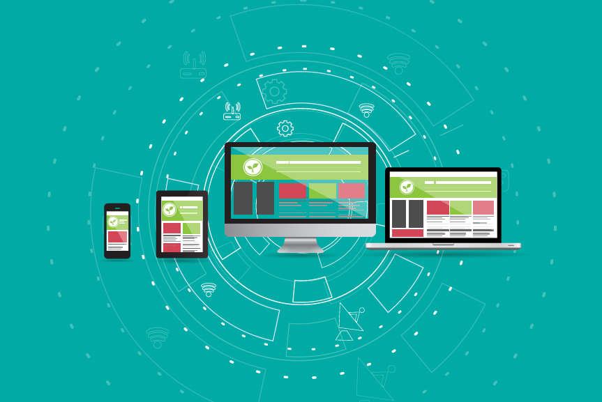
Mobile responsive web design
This allows your website’s content and all design elements to automatically adjust to any device screen — whether it is a desktop, a laptop, a tablet or a mobile phone. This adjustment looks amazing, almost like magic. But InternetDevels web development services company has got magicians who can build it! Responsive design is a smart technology that requires truly professional web designers and front-end developers.
With responsive web design, you have one website with one URL and one HTML, a system with multiple benefits:
- Cheaper maintenance. You don’t have to run two sites, make multiple content updates or run two SEO campaigns.
- All traffic in one place. All your backlinks lead to one website and work for its authority. This is not the case with a mobile website version that exists separately from the main version and has to gain its own “backlink profile”.
- Beautiful simplicity. One URL means no complicated redirects and makes sharing web addresses simple.
Well, are you ready to go mobile? Contact us right now and our experts will make your website mobile-friendly by building a mobile version or by creating amazing mobile responsive design. We can create a mobile responsive website from scratch or make your existing site awesomely responsive! Your mobile clients are waiting ;)